Site Selection & Mining Web App – GIS Dashboard UX/UI Case Study
Overview
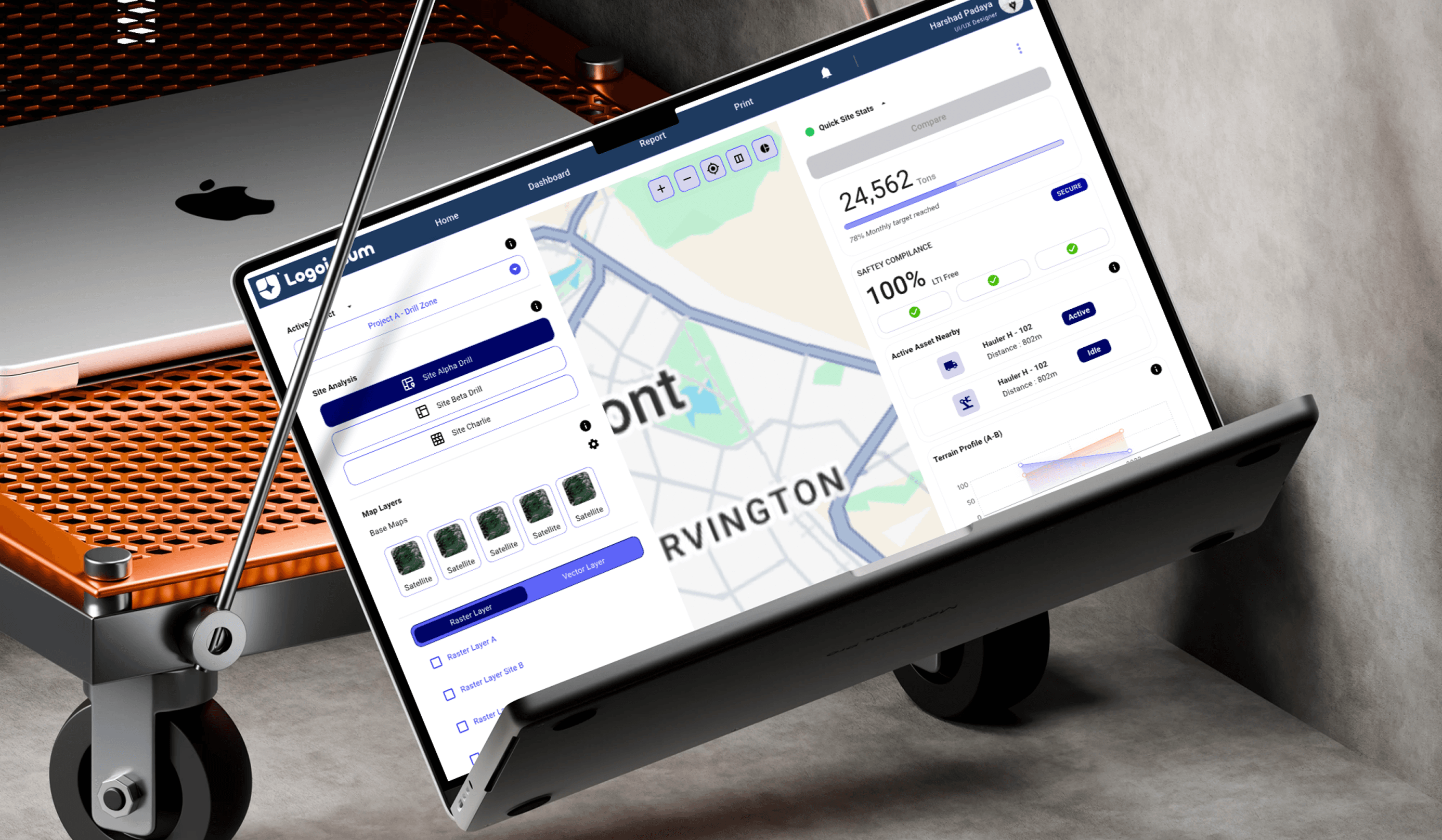
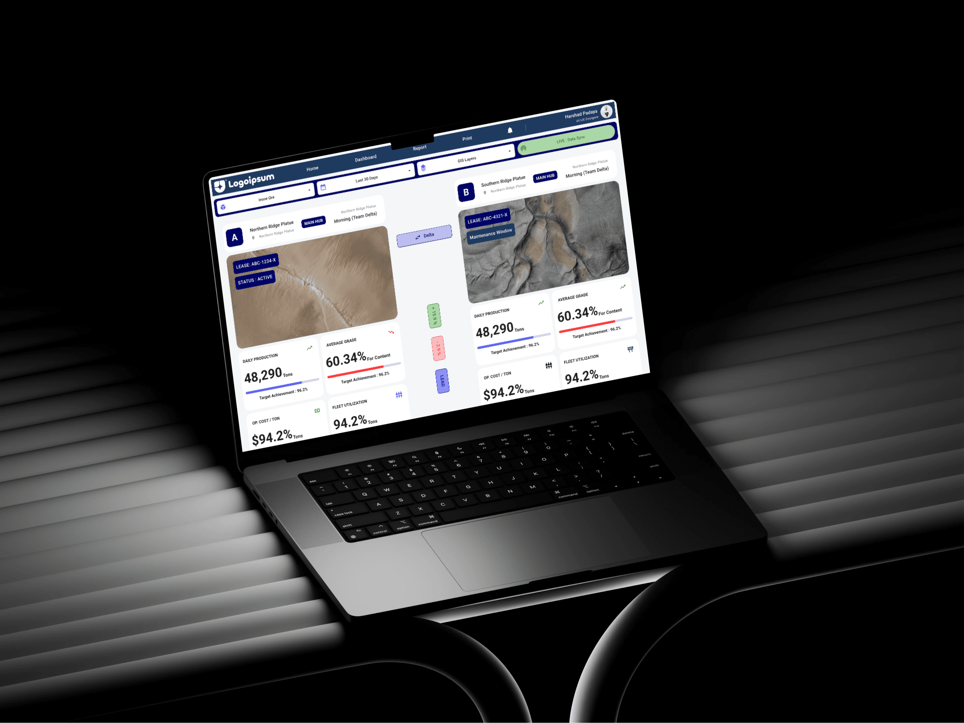
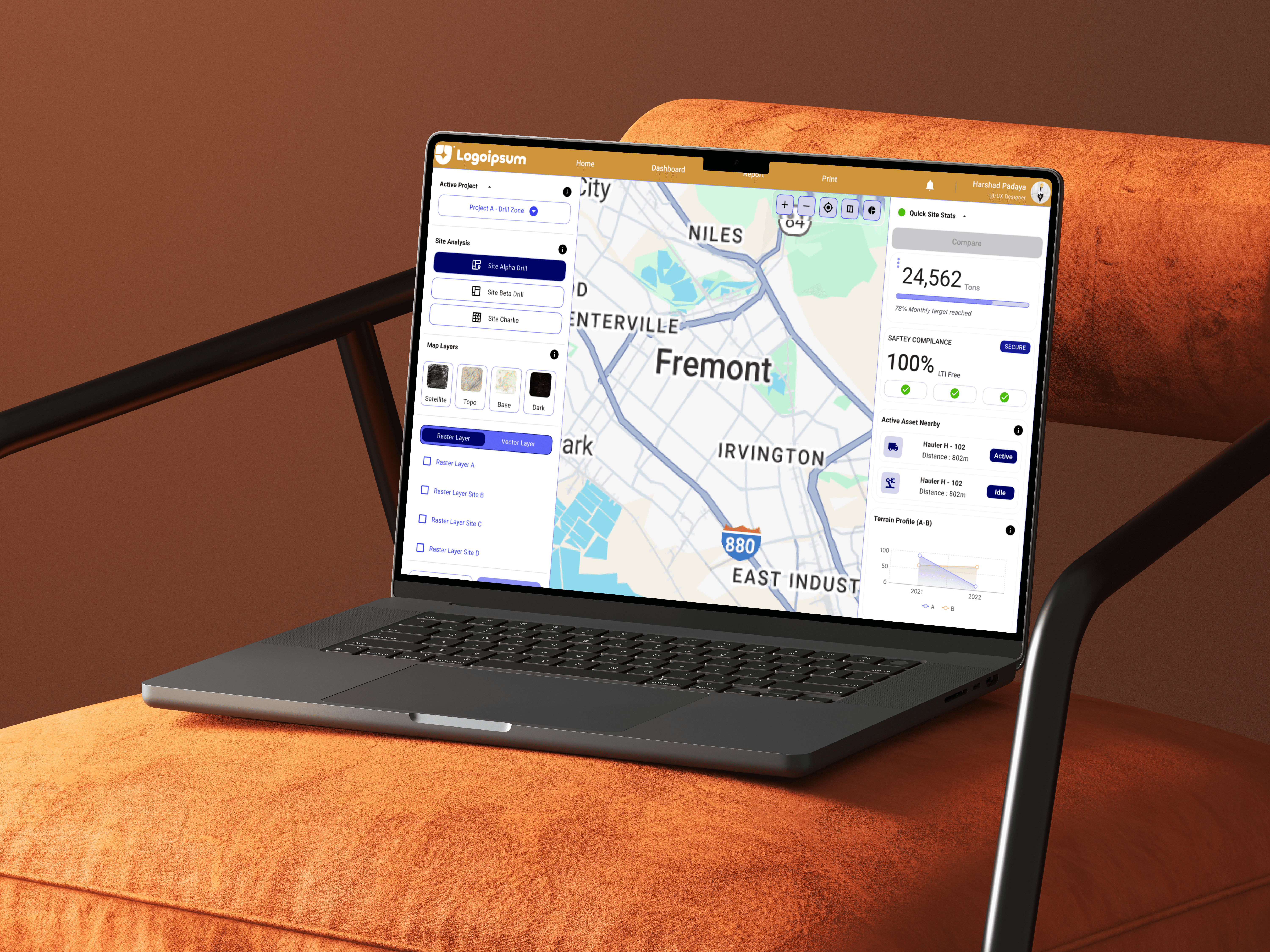
A comprehensive UX/UI case study showcasing the redesign of a complex GIS-based mining dashboard into a clean, intuitive, and data-driven web application. The project focuses on solving usability challenges in site selection, production monitoring, comparative analysis, and operational reporting for mining professionals.
Overview
The Site Selection & Mining Web App is a GIS-powered web platform created to support mining professionals in selecting sites, analyzing operational performance, monitoring production metrics, comparing multiple mining locations, and generating actionable reports.
This project aimed to simplify a highly technical mining dashboard experience into a user-friendly decision-making platform.
Problem Statement
Mining and GIS-based systems often contain overwhelming operational datasets, multiple map layers, production KPIs, and reporting tools packed into cluttered interfaces.
Key pain points identified:
Confusing navigation
Complex map layer controls
Slow site comparison workflows
Poor filter usability
Scattered operational metrics
Difficult report generation
High cognitive overload
Project Goal
Design a modern, intuitive, and scalable dashboard experience that enables users to:
Quickly select and analyze mining sites
Monitor production and operational performance
Compare sites side-by-side
Navigate GIS layers effortlessly
Generate reports with minimal effort
Make faster data-driven decisions
Design Process
The project followed a structured Design Thinking framework:
Empathize
User interviews
Mining workflow research
Competitive benchmarking
Stakeholder understanding
Define
User personas
Problem framing
Journey mapping
Opportunity identification
Ideate
Information architecture
Dashboard structure planning
Interaction flow creation
Feature prioritization
Prototype
Low-fidelity wireframes
High-fidelity dashboards
Map interaction concepts
Test
Usability validation
Feedback iteration
UX refinement
Competitive Analysis
Existing solutions like ArcGIS dashboards and industrial MIS systems revealed common issues:
Steep learning curves
Dense technical interfaces
Weak comparison workflows
Static reporting systems
Poor visual storytelling
Differentiation strategy:
Cleaner layout
Better KPI hierarchy
Simplified GIS interactions
Faster site comparison
Decision-first dashboard design
User Personas
Three primary users were identified:
1. Mine Manager
Needs:
Quick production overview
Site comparisons
Safety and dispatch tracking
Fast reporting
Pain points:
Data overload
Slow workflows
Poor report usability
2. GIS Analyst
Needs:
Layer control clarity
Better filtering
Accurate visual analysis
Faster site interaction
Pain points:
Confusing map behavior
Weak comparison visibility
Inefficient controls
3. Operations Director
Needs:
Executive KPI summaries
Strategic comparisons
Clean visual reporting
Pain points:
Technical complexity
Difficult interpretation
Report formatting issues
UX Strategy
Core UX improvements included:
Simplified top navigation
Clear dashboard hierarchy
Persistent filtering system
Better visual layer states
Fast compare mode
Structured KPI grouping
Improved data readability
User Flow
The optimized user journey includes:
Login → Site Selection → Layer Control → Site Analysis → Compare Sites → Dashboard Review → Apply Filters → Generate Reports → Export / Print
This reduced complexity and improved decision efficiency.
Visual Design System
Design language:
Industrial
Modern SaaS
GIS-focused
Data-driven
Professional dashboard aesthetics
Visual choices:
Strong teal industrial palette
Functional data colors
Clean KPI cards
High readability layouts
Minimal interaction clutter
Wireframing
Low-Fidelity Wireframes
Focused on:
Search + filter persistence
Interactive map-first workflows
Sticky report generation actions
Comparison shortcuts
High-Fidelity Wireframes
Included:
Full dashboard UI
Production KPI panels
GIS visualization
Comparison reporting screens
Export-ready reports
Final Outcome
The final product successfully transformed a dense mining GIS workflow into a clean and scalable digital platform.
Expected improvements:
Faster task completion
Lower learning curve
Better site comparison efficiency
Improved reporting workflow
Stronger user adoption
Reduced decision fatigue
Tools Used
Figma
ChatGPT
adobe illustrations
Duration
3 Weeks
Domain
Mining Technology / GIS Analytics / Dashboard UX Design
Categories
UI/UX Design
GIS Dashboard
Date
Client
Site Selection & Mining Web App – GIS Dashboard UX/UI Case Study
Overview
A comprehensive UX/UI case study showcasing the redesign of a complex GIS-based mining dashboard into a clean, intuitive, and data-driven web application. The project focuses on solving usability challenges in site selection, production monitoring, comparative analysis, and operational reporting for mining professionals.
Overview
The Site Selection & Mining Web App is a GIS-powered web platform created to support mining professionals in selecting sites, analyzing operational performance, monitoring production metrics, comparing multiple mining locations, and generating actionable reports.
This project aimed to simplify a highly technical mining dashboard experience into a user-friendly decision-making platform.
Problem Statement
Mining and GIS-based systems often contain overwhelming operational datasets, multiple map layers, production KPIs, and reporting tools packed into cluttered interfaces.
Key pain points identified:
Confusing navigation
Complex map layer controls
Slow site comparison workflows
Poor filter usability
Scattered operational metrics
Difficult report generation
High cognitive overload
Project Goal
Design a modern, intuitive, and scalable dashboard experience that enables users to:
Quickly select and analyze mining sites
Monitor production and operational performance
Compare sites side-by-side
Navigate GIS layers effortlessly
Generate reports with minimal effort
Make faster data-driven decisions
Design Process
The project followed a structured Design Thinking framework:
Empathize
User interviews
Mining workflow research
Competitive benchmarking
Stakeholder understanding
Define
User personas
Problem framing
Journey mapping
Opportunity identification
Ideate
Information architecture
Dashboard structure planning
Interaction flow creation
Feature prioritization
Prototype
Low-fidelity wireframes
High-fidelity dashboards
Map interaction concepts
Test
Usability validation
Feedback iteration
UX refinement
Competitive Analysis
Existing solutions like ArcGIS dashboards and industrial MIS systems revealed common issues:
Steep learning curves
Dense technical interfaces
Weak comparison workflows
Static reporting systems
Poor visual storytelling
Differentiation strategy:
Cleaner layout
Better KPI hierarchy
Simplified GIS interactions
Faster site comparison
Decision-first dashboard design
User Personas
Three primary users were identified:
1. Mine Manager
Needs:
Quick production overview
Site comparisons
Safety and dispatch tracking
Fast reporting
Pain points:
Data overload
Slow workflows
Poor report usability
2. GIS Analyst
Needs:
Layer control clarity
Better filtering
Accurate visual analysis
Faster site interaction
Pain points:
Confusing map behavior
Weak comparison visibility
Inefficient controls
3. Operations Director
Needs:
Executive KPI summaries
Strategic comparisons
Clean visual reporting
Pain points:
Technical complexity
Difficult interpretation
Report formatting issues
UX Strategy
Core UX improvements included:
Simplified top navigation
Clear dashboard hierarchy
Persistent filtering system
Better visual layer states
Fast compare mode
Structured KPI grouping
Improved data readability
User Flow
The optimized user journey includes:
Login → Site Selection → Layer Control → Site Analysis → Compare Sites → Dashboard Review → Apply Filters → Generate Reports → Export / Print
This reduced complexity and improved decision efficiency.
Visual Design System
Design language:
Industrial
Modern SaaS
GIS-focused
Data-driven
Professional dashboard aesthetics
Visual choices:
Strong teal industrial palette
Functional data colors
Clean KPI cards
High readability layouts
Minimal interaction clutter
Wireframing
Low-Fidelity Wireframes
Focused on:
Search + filter persistence
Interactive map-first workflows
Sticky report generation actions
Comparison shortcuts
High-Fidelity Wireframes
Included:
Full dashboard UI
Production KPI panels
GIS visualization
Comparison reporting screens
Export-ready reports
Final Outcome
The final product successfully transformed a dense mining GIS workflow into a clean and scalable digital platform.
Expected improvements:
Faster task completion
Lower learning curve
Better site comparison efficiency
Improved reporting workflow
Stronger user adoption
Reduced decision fatigue
Tools Used
Figma
ChatGPT
adobe illustrations
Duration
3 Weeks
Domain
Mining Technology / GIS Analytics / Dashboard UX Design
Categories
UI/UX Design
GIS Dashboard
Date
Client